
The Butter Packet Problem: Why Small Brand Details Make or Break Your First Impression
I had the best birthday dinner on Saturday night.
And I cannot stop thinking about the butter.
Stay with me.
The Restaurant That Did Almost Everything Right
We finally made it to Jack's on Main — a tiny restaurant in a small town where there's basically nothing else around. Nine tables small. I'd made the reservation back in November because it books up fast, and it felt like the perfect birthday plan.
The vibe was everything. Loud in that cozy, energetic way. The chef was basically in the dining room with you — from our table we could watch him working all night in an impossibly small kitchen, one dishwasher holding it down beside him. Two servers ran the entire place: making drinks, bringing out every plate, keeping it all moving. It felt like dinner and a show.
And the food? Simple food done really well. Which is harder to find than it should be. Every course came out with this quiet precision where you're thinking, how is he doing this in that kitchen?
We all left saying the same thing: we'd go back, and we'd recommend it to anyone.
But.
There was one moment that caught me off guard. Not annoyed. Just... surprised.
The butter.
You know those tiny single-serve plastic butter cups with the peel-back foil lid? The kind that shows up at a diner breakfast or a catered lunch buffet?
That butter. At a place like this.
Everything else on the table told a story of care and intention. The butter told a different story. It was the one detail that didn't match the experience — and my brain noticed, even when I wasn't looking for it.
The food was still a 10/10. No notes on that. It was just the one thing that quietly pulled the experience slightly out of "fully elevated" territory.
And I couldn't stop thinking about it on the drive home, because it's such a perfect illustration of how visual branding actually works.
It's Usually Not the Big Things
Most of the time, when a brand feels "off" — when something looks almost professional but not quite — it's not because of one glaring mistake.
It's the small details. The ones that quietly tell your brain: this is premium or this is pieced together. The ones that create a feeling before anyone can explain why.
A mismatched color on your website versus your Instagram. A font that shifts between pages. An email template that looks like it belongs to a completely different brand than your website. None of these things are catastrophic on their own. But together? They add up to an impression your potential clients are forming before they ever reach out to you.
Your offer can be exceptional. Your work can be genuinely transformational. But if a few of your brand touchpoints don't match, the whole experience feels slightly less polished than it should — and people feel that, even when they can't name it.
That's the butter packet problem.
The Two Most Common "Butter Packet" Moments I See
After ten years of working on visual brands for service providers, these are the two details that consistently pull an otherwise solid brand out of "elevated" territory:
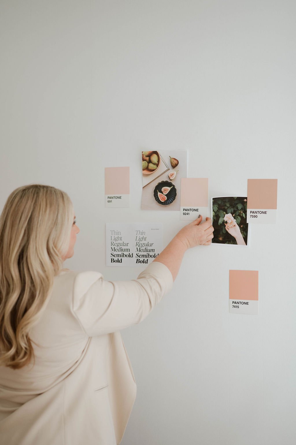
Inconsistent colors across platforms. Your Instagram has a warm, neutral palette. Your website runs cooler and brighter. Your emails are a completely different vibe. Each piece might look fine on its own — but the moment someone moves between them, the disconnect registers. It creates a subtle "wait, is this the same business?" feeling that erodes trust without anyone realizing why.
Too many font styles. A different heading font on your homepage versus your services page. Body copy that shifts weight or size from section to section. Fonts pulled from different design kits that almost-but-don't-quite-work together. It seems like a tiny thing. It isn't. Typography is one of the fastest ways a brand signals "professional and intentional" or "DIY and inconsistent."
Neither of these is a disaster. Both are completely fixable. But left unaddressed, they're quietly working against every other effort you're making to look established and trustworthy online.
Why This Matters More Than People Think
Here's what I keep coming back to: your potential clients are making snap judgments about whether you're the right person to help them. That judgment happens fast — often before they've read a single word of your copy.
They land on your website. They scroll your Instagram. They open your welcome email. And their brain is running a quick, unconscious calculation the whole time: does this feel like someone who has it together?
When your visuals are cohesive — when everything looks like it belongs to the same brand — that calculation tips in your favor immediately. It builds trust before you've said a word. It makes the quality of your work feel like a given, not something they have to take your word for.
When there are butter packet moments scattered through your online presence, the calculation goes the other way. Not dramatically. Not always consciously. But enough to create hesitation where there shouldn't be any.
The Good News: You Don't Have to Start Over
This is honestly why I've been so focused on brand styling this year — because the fix is almost never "burn it down and start fresh."
Most of the time, it's about tightening the details. Getting your colors documented and consistent. Locking in a typography system that works together. Making sure your logo files are actually being used correctly across every platform.
It's the difference between a brand that feels almost there and one that feels fully elevated. And more often than not, the gap is smaller than it looks from the inside.
If you've been feeling like your brand is close but something's still a little off — you're probably not imagining it. Sometimes it really is just the butter.
And the right foundation fixes it.
The Styled Brand is a complete visual foundation — logos, colors, fonts, and a brand guide that makes everything feel cohesive across your website, emails, and social media. If you suspect you have a few butter packet moments floating around, this is where we start. Explore The Styled Brand →