
5 Signs Your Website Needs a Branding Update (Even If You're Not Ready for a Redesign)
You don't need to hate your website to know something's off.
Maybe it just feels a little dated. Maybe your Instagram has evolved but your site is still living in 2020. Maybe you've leveled up your services, your pricing, and your confidence — and your website quietly hasn't kept up.
These are the moments worth paying attention to. Not because you need to blow everything up and start over, but because small misalignments have a way of adding up. Your website is often the first thing a potential client sees. If it doesn't reflect where your business actually is right now, you're working harder than you need to.
Here are five signs your website is due for a branding update.
1. Your Fonts Feel Generic or Dated
Typography does more work than most people realize. It sets the tone before anyone reads a single word. If you're using default fonts, haven't touched your typography since you launched, or chose something trendy that now feels very 2018 — visitors notice. They can't always name it, but something feels slightly off.
Updated, intentional typography is one of the fastest ways to make a site feel more current and more you. It's also one of the things that's hardest to get right without a clear brand foundation to build from.
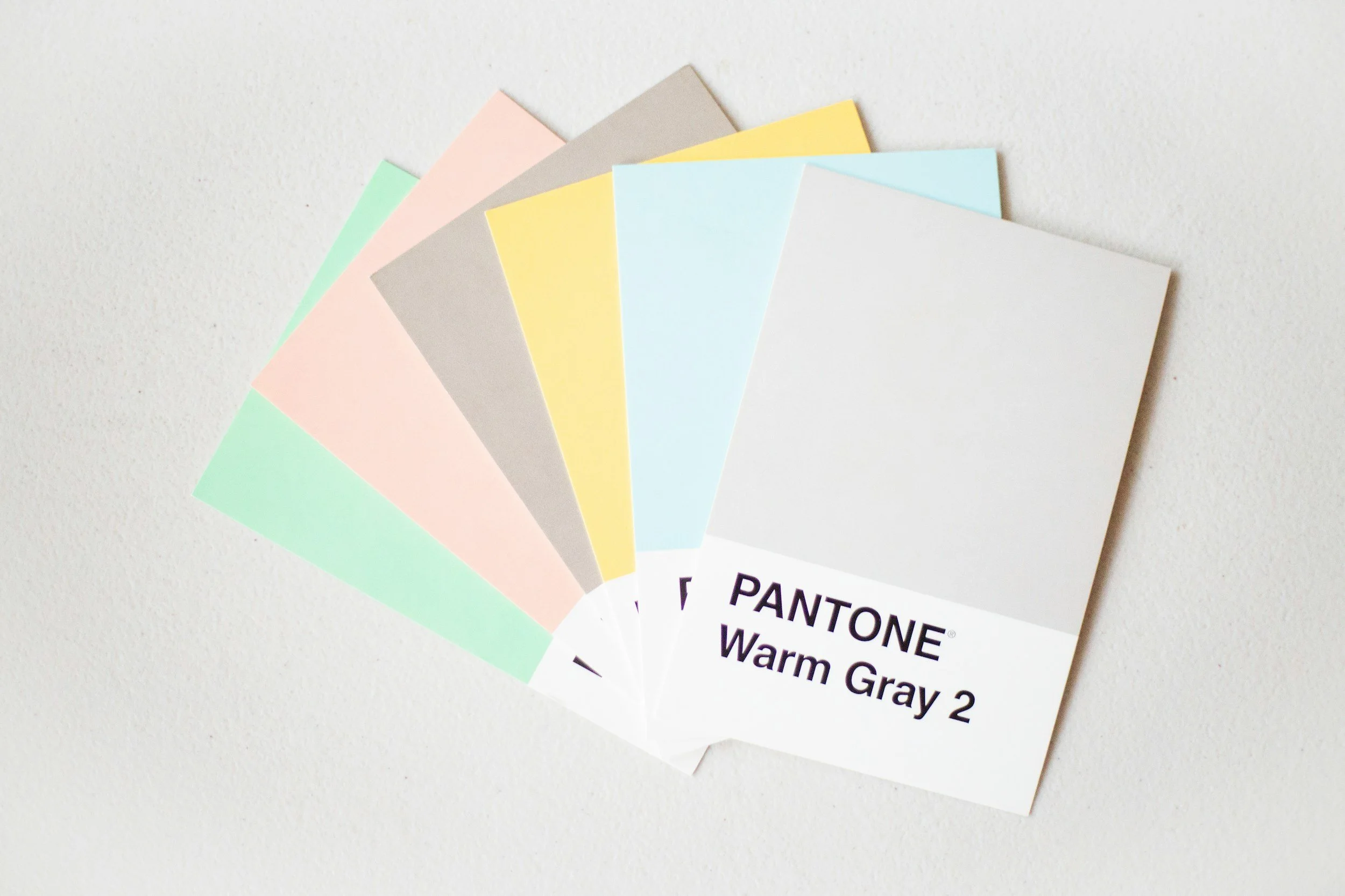
2. Your Color Palette Isn't Doing Anything
Color creates mood. If your palette feels flat, inconsistent, or like you just picked colors you liked that day without thinking about how they'd work together across your whole site — that shows.
The fix isn't always picking new colors. It's having a clear, intentional system: a primary palette, an accent, and the discipline to actually use them consistently. When your colors are working, your site feels cohesive. When they're not, everything looks pieced together.
3. Your Photos Are Pulling the Energy Down
Outdated headshots, inconsistent stock photography, or images that don't match the tone of your brand can quietly undermine an otherwise solid site. Visitors process visuals before they read your copy. If the images feel off, the whole page feels off.
This doesn't always mean booking a full brand shoot immediately — but it does mean being honest about whether your current imagery is helping or hurting the first impression you're making.
4. Your Logo Feels Like a Placeholder
A lot of service providers launch with something quick — a Canva logo, a simple wordmark, something that worked when they were just getting started. And then they keep it for three more years because redesigning feels like a big project.
Your logo doesn't have to be elaborate. But it does need to feel intentional and current. If you wince slightly every time you send someone your website link, your logo is probably part of why.
5. Nothing Feels Like It Belongs Together
This is the big one. You can have decent fonts, okay colors, and fine photos — but if your website, emails, and Instagram feel like they belong to three slightly different businesses, the overall impression is scattered.
Cohesion is what makes a brand feel established. It's the difference between a business that looks like it's been around and one that looks like it's still figuring things out. And cohesion doesn't happen by accident — it comes from having a clear visual foundation that everything else is built on.
What to Do About It
If you're nodding at two or three of these, you're not behind — you're just ready for the next step.
Sometimes that's a focused brand refresh. Sometimes it's a full site redesign. Sometimes it starts with The Styled Brand — getting your visual foundation locked in before anything else gets touched.
The best place to start is a conversation about where things actually stand.